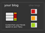
 Sarah over at The Sheck Spot, while asking me about joining Library Links, alerted me to this neat app called Feevy. Basically, it creates a nice dynamic collection of blogs - or any web content that has an RSS feed (flickr, delicious, etc). So, rather than blogroll of static links, you can have a nifty display with the blogs' latest posts.
Since this is relatively new, and not overly customizable (yet), I thought that for a blogger with a large links list, the display might become unwieldy. However, in terms of library use, I figured this might be a cool app for my library blogs. This way, readers of one blog can get a quick taste of what's going on on the other two blogs (and this would work with any feeds you might happen to have on your library's homepage - and some of you cool libraries have a few!). I used the unobtrusive "liquid" style on our main blog, and the funkier "classic dark" style on the Teen Spot blog. I like this. Now I won't have to do as much cross-posting as I currently do, and the adults can see what's up over at the Teen blog without subscribing to it or leaving the main blog to take a look (and vice-versa). Cool.

3 comments:
I'm glad you dig Feevy. While it is still a little rough around the edges, it has helped me keep up with my favorite blogs and saved me a lot of clicking. I love that you are adding it to your library's blogs!
Super cool, cool librarian!
i agree with sheck - glad you dig feevy.
for me, feevy helps me keep up with the blogs i want to keep up with. but also, feevy generates mini-communities, i think, especially when blogs within a feevy share some kind of common theme (like being library/librarian blogs).
This is cool. It wouldn't work for my huge blogroll, but I'm thinking of copying your idea, only for my personal blogs.
Post a Comment